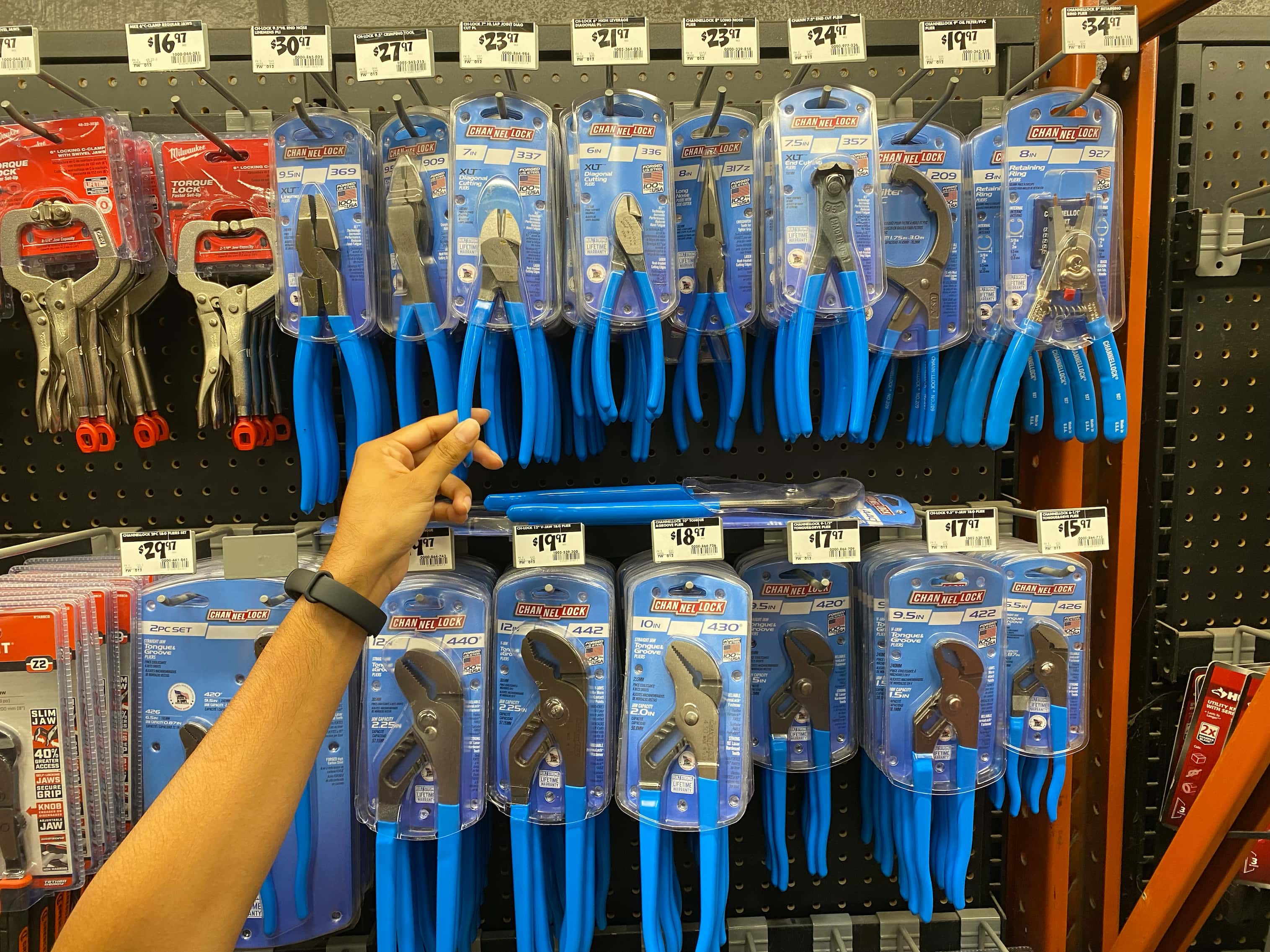
A planogram, often called a POG or “pog,” refers to the physical layout of products in a bay at a retail store. Each retailer will have a different strategy for arranging your category for merchandising, but they do consider input from the brands they stock.
As part of your PLR, you’ll be expected to present a sample planogram that shows how you feel your products should be arranged on the shelves alongside competitors. But it’s not enough to simply assign yourself primo shelf space – your merchant will look for a compelling justification for your choices.
What makes a planogram good or bad?
There’s no feng shui involved: the difference between a good and bad planogram is simple.
A good planogram is one that is easily shopped. The bay is arranged in a way that helps consumers reach a decision quickly and confidently.
A bad planogram is confusing and makes it harder for shoppers to locate the right product.
How do retailers choose the planogram for your bay?
As long as the planogram makes intuitive sense to shoppers, there are many ways to organize a bay. The decision ultimately rests with the retailer, but don’t underestimate your opportunity to influence how your products are merchandised.
Remember that all of your category competitors are bringing their own ideas to the table. In order to gain an edge, you’ll want to present a planogram that is grounded in research and reflective of the retailer’s goals as well as your own.
How to Present a Good Planogram
1. Know the retailer environment.
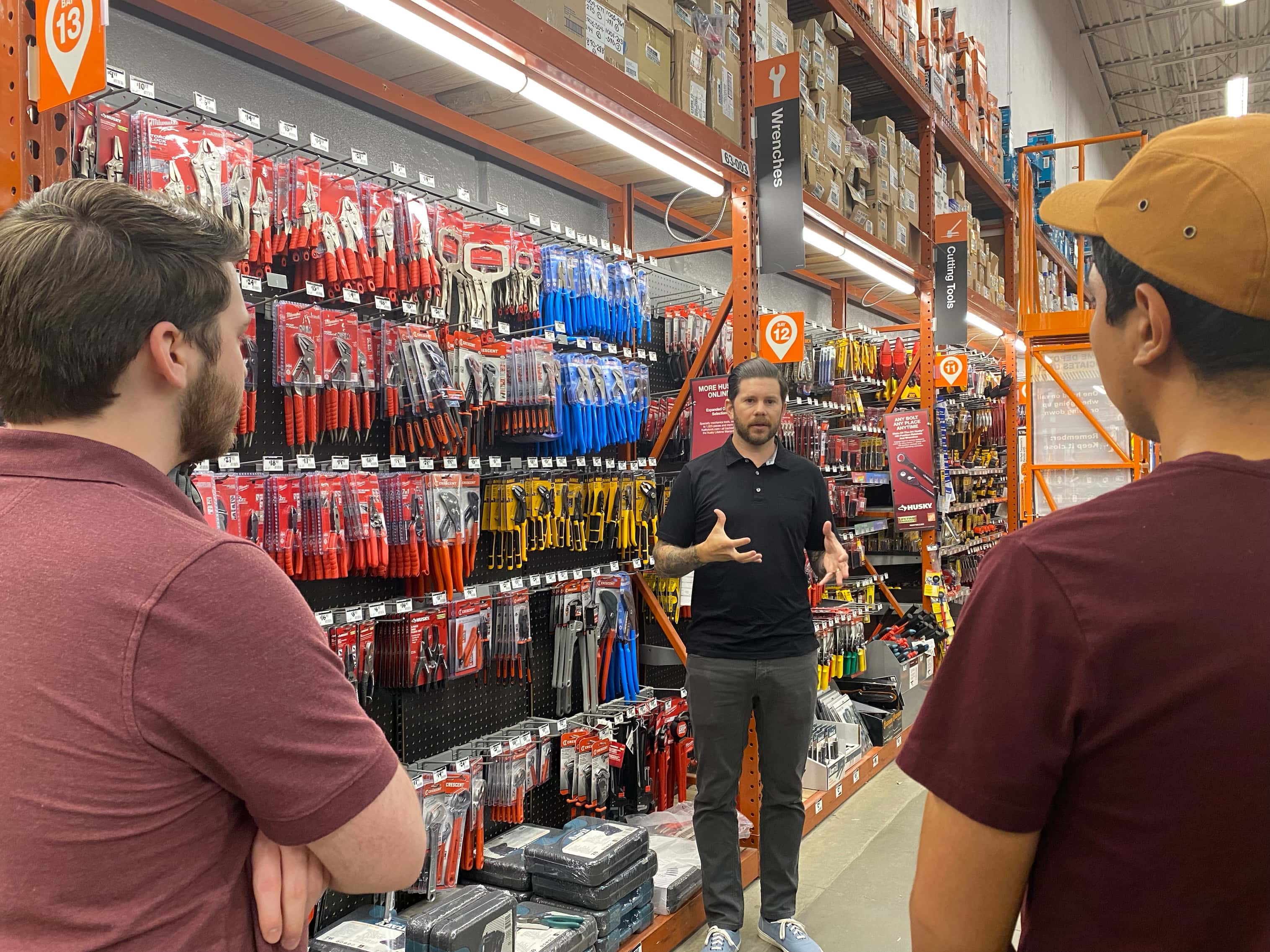
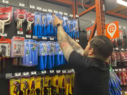
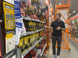
Before you can suggest a planogram, it’s important to be aware of what the retailer is already doing with your category. The best way to do this is to personally walk several store locations.
Notice what is working and what isn’t, and try to see the shelves through the eyes of a shopper. Is the bay organized? Is everything accessible? Look for opportunities to simplify decisions and move consumers up the price progression with less friction.
2. Know the consumer.
When you walk different retailers’ stores, you’ll notice a variety of strategies for organizing SKUs. Some arrange items according to price or the specific subtype of product. Others prefer to cluster brands together on shelves. Some stores group items vertically while others choose a horizontal layout.
The rationale behind these choices almost always goes back to the consumer. As you prepare your planogram, do your research to understand who is shopping at your retailer’s stores and why. Brand-conscious Pros will probably have a better shopping experience at a retailer that features a brand’s whole product line in one row, while a cost-conscious shopper just wants to easily examine the price progression.
An effective planogram is engineered to support your sales velocity. Understand your consumer to help them reach a decision quickly. Design choices like double -facing quick-selling products can help you stay in stock so you move product faster. Do your homework to understand your customers’ relationship to your product, category and retailer so you can design a planogram responsive to their needs.
3. Put it to the test.
The best way to ensure that you’ve chosen an optimal planogram design is to try it out.
Your ramp-up period is a great opportunity to A/B test different organizational strategies. Use your first few locations to work out the finer points of your planogram, like a horizontal vs. vertical layout.
Take your learnings back to your merchant as you get ready to scale. Empirical data always carries weight when the time comes to make decisions about your position on the shelves.